Thursday, 28 February 2013
The Treatment
The Magazine: PUMP IT UP
Target Readership: PUMP IT UP is a new magazine aimed at females who enjoy pop music. The reader is aged between 12-16 year old. At this age they are now more involved with the latest music and up to date with new songs. The readers of the magazine may by now have part time jobs earning their own pocket money for them to buy the magazine if released weekly or monthly. Parents of readers will fall into the C1/C2 socioeconomic grouping, this then means they can buy the magazine for their daughters. Readers of Pump it up have a strong interest in programme's such as X Factor and Pop Idol. PUMP IT UP is the girl that wants to be up to date with the latest gossip. She is bold and sassy, she is very keen to get the most out of life.
Form and Style: PUMP IT UP is an A4 colourful, jampacked magazine with celebrity gossip, interviews, fashion and quizzes. The cover contains models of approximently the same age as the target audience. The colours used are very bright colours such as pinks and purples. Each issue will feature famous bands and artists, these will either be the popular boy band or attractive female role models. X Factor and actors and actresses from wellknown teen TV programmes will appear throughout the magazine. Coverlines show the magazine to contain a lot of material , dealing with issues that every teenage girl wants to know about. The fonts used are simple and bold which are easily read. The graphics used often have a cluttered feel to give the effect that this magazine is a good value for money. The magazine will sell at £2.00, this is an affordable price for a teen magazine making it realistic.
Themes and Typical features: PUMP IT UP will have a regular theme occuring of an everyday teen magazine. Every issue will contain celebrity gossip, interviews, latest music releases aswell as fashion and questionaires/quizzes. There will be a strong focus on male artists and boybands which most teenage girls are interested in. However the magazine will also contain other information such as friendships,pets and school work. The magazine overal will be informal and chatty, the use of language will be familiar to the target audience, this will hopefully avoid the reader becoming bored and not wanting to read on.
Potential advertisers: A range of brands will feature in the magazine which relate to the target audience. Make up brands will appear, online shopping websites will be feature and also retail shops.
Editorial Team: The editorial team for PUMP IT UP will be made up of well experienced magazine writers, which have worked with magazines aimed at teenagers in the past, they have previously worked with other magazines Girl Talk and Top of the Pops.
Wednesday, 27 February 2013
CONTENTS PAGE LAYOUTS


These are my possible contents page layouts which I will be using for my music magazine.
COVER PAGE LAYOUT
These are my possible cover page layouts. However I have still not decided which one to use. I prefer the 3rd one but I also like the 1st one. Due to deciding to produce a pop magazine, it is going to be a very cluttered and colourful front page filled with a lot of pictures and coverlines.


Monday, 25 February 2013
PHOTOSHOP PRACTICE


After completing this exercise with photoshop, I now feel more comfortable using it when I come to make my own music magazine cover!
Thursday, 21 February 2013
ACTION PLAN
ACTION PLAN!!
11th-15th Feb
Layout designs
Font designs
Treatment Sheet
18th-22nd Feb
Plan Photo shoot
Take Photos
Save selection
Textual Analysis on 3 covers, 2 contents and 2 Double Page Spreads
25th-1st March
Make Front Cover
Post drafts
Collect Audience Research
4th-8th March
Font designs
Treatment Sheet
18th-22nd Feb
Plan Photo shoot
Take Photos
Save selection
Textual Analysis on 3 covers, 2 contents and 2 Double Page Spreads
25th-1st March
Make Front Cover
Post drafts
Collect Audience Research
4th-8th March
Make Contents Page
Make Double Page Spread
11th-15th March
Test Pages
Start Evaluation
Make Double Page Spread
11th-15th March
Test Pages
Start Evaluation
The Questionnaire
1. How old are you?
2. What type of music do you like listening to?
a. pop b. rock c. country d.classical c.other
3. At what price would you buy the magazine?
4. Would you like a poster in every issue?
5. What would you like to see in the magazine?
a.gossip b.interviews c.fashion d.pictures c.best songs d.other
I gave my questionnaire out for people to fill in, most of these people were at the age 0f 16-17 years old! The results were very interesting, at least 80% of the people preferred pop music. Nearly everyone wanted a free poster with every issue, and maybe even a free gift. The average price was around 1/2 pounds.
These results will now help me with my own music magazine. Thank you! :)
Thursday, 14 February 2013


Wednesday, 13 February 2013
TEXTUAL ANALYSIS OF CONTENTS PAGE
 The colour scheme of the contents page is a grey colour. The celebrity used, Kanye West is very serious, the colours of the page could relfect his mood of being serious and thoughtful. The use of grey makes the heart stand out which is red, this shows the importance and passion of music within him. Direct address is used making the reader feel more involved. The use of the hand suggests him being locked in this could symbolise how they want the reader to be. they are so interested that they want to read on. All text is to the right hand side of the page, showing what is contained in the magazine.
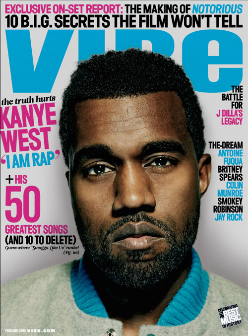
TEXTUAL ANALYSIS OF FRONT COVER
The masterhead 'VIBE' almost acts like a logo for the read, this is a
unique name which the reader can refer back to. It is in big bold font
placed at the top of the page, which makes it stand out. This catches the readers eye easily making them most likely to pick up the magazine to read. The direct quote
used from Kanye West 'I AM RAP' is appealing to the audience
as they are interested in what he has to say, this will attract fans of his
to read the magaizne further. This is the most important coverline on the page, is placed to the left of the page in big, bold pink font. This stands out the most as it relates to the celebrity on the page. The use of celebrity endorsement also draws the reader in, by the celebrtiy appearing on the front page they are most liekly going to appear within the magazine. Fans will be interested
to read on further to keep up to date with their favourite artist.
this makes it more appealing showing facial expressions. The use of direct address makes it more personal showing confidence about reading on further. Coverlines are used on both sides of the magazine. The colours of the magazine used clash, pink and blue. This could also symbolise both boys and girls, suggesting a unisex target audience.
TEXTUAL ANALYSIS OF POP COVER PAGE
'Just Pop Magazine'

'Just Pop!' magazine is aimed at a young teenage girl audience. The colours used are very feminine, the pinks, purple and yellows used show this. The magazine front cover is very cluttered, containing a lot of pictures and information. The front cover contains many pictures of celebrities, this attracts readers as they are interested to see more pictures and find more information about these celebrties. By having the boyband 'One Direction' on the the front cover this will attract many female fans resulting into many copies being bought. Posters are advertised on the front cover, which is also a reason why fans will buy the magazine, as they collect posters of their favourite celebrities. The picture is against a white background, this makes the picture stand out making it the main focus. The strap line used at the top of the page advertises winning One Direction headphones and Pixie Lott accessories, this is also a main benefit of buying the magazine, as the reader may be lucky and win them if they try. The main cover line of the page is 'One Direction' as they are relevant at this moment in time, with a lot of fans following their every move. The strap line at the bottom of the page 'plus' also attracts the readers eye. Aswell as all the information contained already in the magazine the additional article on Justin Bieber, who also is popular with the target audience the magazine is aimed towards.
Subscribe to:
Posts (Atom)